PROSPERO User Manual
Contents
- Overview
- Menu Bar
- Guest Users, Registration and Login
- Enter Sequence and Experimental Results
- Add a Project
- Add a Sample
- Add Sequence
- Add Experimental Results
- Differential Scanning Fluorimetry (DSF), aka Tm curves
- Dynamic Light Scattering (DLS)
- Size Exclusion Chromatography (SEC), aka Gel Chromatography
- Enter SEC values by hand
- Upload SEC files from AKTA software
- SEC curve fitting results
- Upload SEC XML files
- Expression yield
- Gel of purified protein (SDS PAGE)
- Limited proteolysis gel (LP)
- Summary of Sample Results
- Predict Crystallization Outcome
- Input Experimental and Sequence Data
- Predicted Outcome: Average Diffraction Score
- Recommendations for Difficult Targets
- Distribution of Scores
- Decision Tree
- Expanding the Predictor
- Appendix
Overview
PROSPERO (PRediction of Outcome using Sequence & Protein Experimental Results Online) can help you:
- store, share and analyze sequence and experimental data for your samples,
- estimate the probability of obtaining well-diffracting crystals, and
- prioritize future efforts for proteins which fail to crystallize in initial trials.
The the basic steps are:
- Use as a guest, register or login to your account
- Add sequence and experimental data
- Submit your data for prediction of crystallization outcome.
This manual goes through these steps in detail.
You can also use PROSPERO's tools independently of the predictor to fit differential scanning fluorimetry (DFS, aks Tm) or size exclusion chromatogram curves:
- upload your experimental data to the fitting server , or
- download the fitting software and run the analyses on your own computer
(requires Perl and gnuplot installed locally).
Details
Menu Bar
Each page of the site has a menu bar just below the logo at the top, in white letters on black. Options include:
- Home - opening page to start work or get PROSPERO publications and citations.
- Documentation - this user manual and other instructions and information about the site.
- Downloads - get source and documentation for our input modules, so you can use them locally or modify them to use your file formats.
- Example Output - view a sample prediction, and the data from all six types of experiments (Note: each of the parts of this example are real, but they are drawn from different protein samples to better illustrate the analyses).
When you first go to the site, you also get these options:
- Guest Access - start using the site without registration
- Login - enter your password to start using the site as a registered user
- Register - select a password to register and log in.
- Projects - go to the list of all your projects to add, edit or use data for analysis and prediction.
- Account - view and edit your account settings, including your password.
NOTE: Guests can register at any time by editting their accound settings. - Logout - end your PROSPERO session.
Guest Access, Registration and Login
When you first go to the PROSPERO home page, you have the option to use the site as a guest, to login to an existing account, or to register a new account. All users can securely store data between logins, though guest data is subject to deletion after several days unless the guest user registers. Registration makes it easier for users to log in again and access data added in previous sessions. Registered users can also more easily share data with other users on the same project.
Guests
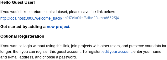
To use PROSPERO as a guest, click use as a guest on the home page or Guest Access in the menu bar on any page. You will get a welcome page:
|
|---|
with options to:
- save (or click on and bookmark) a URL so that you can return to your data in later sessions,
- edit your account to register, or
- start adding data by clicking new project (see adding projects below).
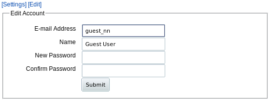
The URL link takes you to get a "Welcome back" page with options to register or go to your projects. You can register at any time during this session by editting your using the edit your account link on the welcome page or use the Account menu tab then click Edit. You get a form:
|
|---|
Enter your email address and password to register.
Registration
When you click Register from the home page or menu bar, you get a similar short form:

|
|---|
Only the first 4 lines are required. Your email address is used as your account name. Registration information is private and will not be shared with anyone; we will only send e-mail to the address you supply if you forget your password. Your institutional affiliation information will assist us in helping you maintain shared data access, but is not required.
Once you click Submit you are automatically logged in to your new account. The next time you use the site, you only need to enter your e-mail address and password to log in.
Enter Sequence and Experimental Data
When you click on "projects" as a guest user, register as a new user, or log back in to PROSPERO, you start out at the "All Projects" page. The first time, you'll start with an empty "Projects" table:
|
|
|---|
This page is the starting point for viewing and adding to the PROSPERO data hierarchy:
▉ User is at the top level.- Each user can have many projects, and each project can be shared by many users
In version 1.0 of PROSPERO, you can store and share results for sequence and for six types of experiments (though only the first four types are used in the original prediction model, HyGX1):
- Differential Scanning Fluorimetry (DSF), aka Tm curves
- Dynamic Light Scattering (DLS)
- Size Exclusion Chromatography (SEC), aka Gel Chromatography
- Expression yield
- Gel of purified protein (SDS PAGE)
- Limited proteolysis gel (LP)
Add a Project
To add samples and results, start by adding a project with the Add new Project button above the "Projects" table. This brings up a form where you should give your project an easily identifiable short name. You can also enter a longer description of up to 255 characters.

|
|---|
The project name is displayed in bold letters above the table for this project (see next figure). The description is written in smaller type below the name on that project page. The name will also used in the "Project" column of the All Projects table;

|
|---|
this will be more readable if you keep the name fairly short. Once you've drilled down into this project, the name also shows up in the navigation outline at the top of the page to identify which project you're in.
Once you enter project name and description, click "Submit" and you'll see an empty table for this project:

|
|---|
You can now:
- Go back to the table of your projects with the All Projects link at the top,
- Change the project name or description with the Edit button to the right of the name,
- Give other users access to this project with the Access Control button on the "name" line, or
- Add a sample to this project.
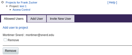
Access Control (Project Membership)
The creator of a project can add other users to the project. Those users can see the data for all samples in that project, and can add samples and sample data to the project. Clicking Access Control from the Project page gives you a form:
|
|---|
The Allowed Users tab shows any users you have already added to the list of those who have access to this project. You can select and remove users from the list with checkboxes and the Remove button.
The Add User tab (or the "Add user to project" link) lets you give access to more users by entering their e-mail address. If you use this tab to invite a user who is not already registered in PROSPERO, or if you directly use the Invite New User tab, you get a form to enter the user's name as well as e-mail address. When you Submit, PROSPERO uses that address to send and e-mail invitation containing a link to the "Welcome" page as for guests. The invited user can then save the link or register to access your project.
All users with access to a project can read or add samples and sample data to
that project.
Only the user who created a project (the "owner") can grant other users access
to that project. If you have access to projects owned by other users, the owner's
name will show up in the "All Projects" table ("Projects for
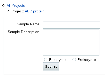
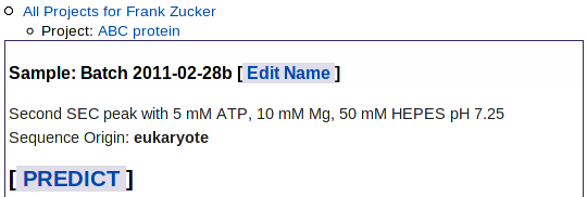
To add a sample, click Add next to the "Sample" header in the table.
You get a form where you can fill in a relatively short sample name to be
used in table columns and navigation outlines, and a longer description (up
to 255 characters) displayed above the table for this sample.
Below the description, you can also specify whether this sample is from a
sequence of eukaryotic or prokaryotic origin (the origin of the gene, not
the type of heterologous expression system used).
This helps in the interpretation of sequence analysis and experimental results:
PROSPERO's HyGX1 prediction algorithm was based on
eukaryotic proteins and in our tests is the best method for predicting outcome
for these proteins. Pxs
was based on, and makes better predictions for, bacterial and archeal
proteins; PROSPERO includes the Pxs results in its report, when possible.
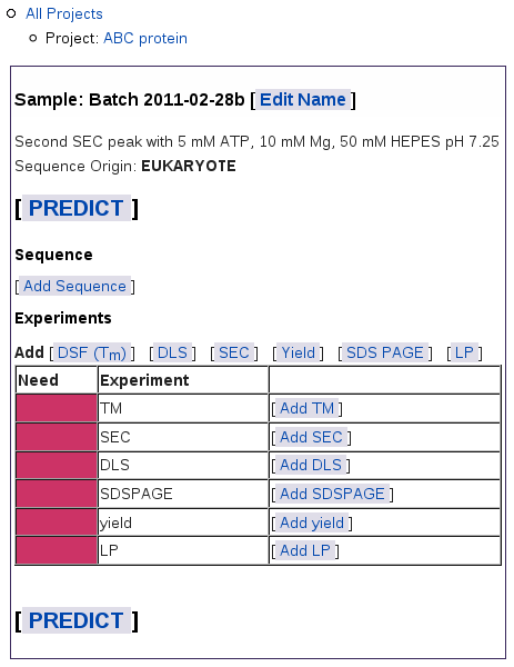
When you submit this form, you get a blank table for this sample:
The navigation outline above the table shows which project you're in
and lets you navigate up to the table of all samples for this project, or
to the table of all projects. On this Sample page, you can:
The colored bars in the left column show what data you still need:
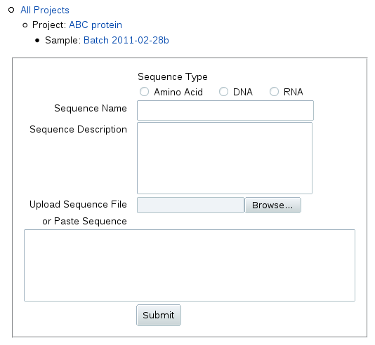
When you click Add Sequence, you can upload or
paste in the sequence as one-character IUPAC symbols:
Enter a name and description for the sequence, e.g. the gene identifier
and the start and end points of truncatation (or indicate it's full length).
Sequence names that are distinct from sample names are especially important
if your sample contains a complex of different macromolecules.
PROSPERO can store and share data for nucleic acids,
though it will not be able to accurately predict their crystallization
with the current HyXG1 predictor.
For nucleic acids, change the sequence type to DNA or RNA.
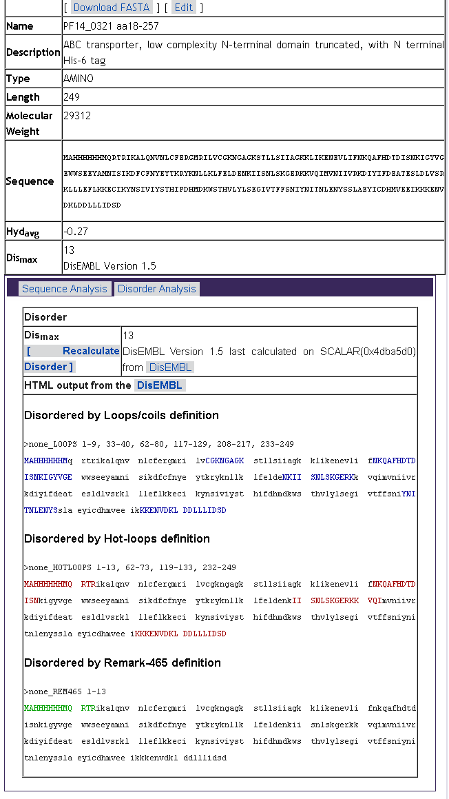
When you submit the sequence, you get a new sequence table on the Sample page:
You can now go on to add experimental results, or
click on the sequence name to see details of the sequence analysis such
as estimated MW, hydropathy and predicted disorder:
To upload or enter results, click the "Add" button for that type an experiment:
DSF aka Tm,
SEC,
DLS,
yield,
SDS PAGE or
limited proteolysis.
Each type of experiment has its own type of
data. In most cases each brand of equipment and each version of software
will export that data in different formats.
PROSPERO uses input modules to convert exported data
into a standard XML format and analyze that data to derive summary values
for each experiment. It then reports those summary values and uses them
to predict crystallization outcome.
In most cases, you have several options:
The first option is most convenient: other options require some expertise
in either programming or analysis. If your data is in a form that our input
module cannot handle, you can download our input module and modify it, or
contact us. We may be able to help by modifying our general input module,
or by sending you a specially modified module, to handle your data.
If you have a better method for analyzing the data, we'd also
like to hear about that.
Differential scanning fluorimetry uses the dequenching of a fluorescent
dye on binding to hydrophobic pockets to monitor proteins unfolding.
The temperature at the midpoint of the unfolding transition, Tm,
is a measure of protein stability and has been reported as predictive of
crystallization success (Dupeux et al. 2011 Acta Cryst. D67, 915-919).
In our predictor, the most important characteristic of the melting curve is
the relative fluorescent intensity at low temperatures.
We quantify this as R30, the ratio of fluorescence at 30°C to
fluorescence at Tm. For proteins of less than 36kDa, we found
that almost all of those with low R30 (<0.1) produced well-diffracting
crystals, in sharp contrast to those with high R30 values.
Click "Add DSF" to load or enter results from (Tm) experiments.
This gives you a form with several options for loading data:
You can now:
If you do not have the data file available, just the summary analysis or image
of the Fluorescence vs Temperature curve, then enter:
Estimates of Tm and FWHM are usually available from the DSF machine,
but may not be reliable. You will need to calculate R30 from the
intensity values at 30 °C and Tm yourself.
If you have the data file available, click Upload data file to load it
and select wells for analysis. You'll get a simple upload form:
This will send your data to our input module, which can take a variety of
formats as long as the file has:
See
DSF (Tm input format
details
for more information on what formats you can load and how to convert among
formats.
If you have a file you've already analyzed with your own input module,
and you want to keep that analysis rather than having it redone by our site,
click Upload XML file to get a similar upload form for files in
the
XML format
produced by our input module.
Note: The XML format includes the original data as well as the
analysis and summary, so you can also upload XML files and have them
re-analyzed using the Upload data file button. This would only
be useful if we make a major improvement in our analysis program and you
no longer have the original data file. Then you can download a .tmc.csv
file in our XML format from PROSPERO and re-upload it.
Also, since HyXG1 used only samples with no ligands added after purification,
the predictor may not be accurate using wells with added ligand.
You can analyze all the wells and then later choose not to use some of them for
prediction. If you're doing ligand screening, you probably have several
control wells with no added ligand. Those control wells are the ones you
should use for prediction.
To start with, you can select from a list of the wells by the well labels from
the file you uploaded:
Check boxes for one or more samples, then hit Submit. Or you can
choose a different view of the sample list using the buttons in the upper right
corner. Thumbnails gives you a small fluorescence vs. temperature graph
for each sample:
If you have to choose from many samples, e.g. from a 96-well plate,
you would have to scroll through several pages to select by thumbnail or
even by list.
If you know which well positions in the plate you want to use,
then you may be able to use Grid to select wells from an 8x12 grid:
This option will only work if your labels can
be interpreted as well positions, i.e. if they start with "A1" or "A01"
to "H12", possibly followed by a colon or space and well composition e.g.
Once you have selected the wells you want using any of the selection forms,
hit the Submit button on that form. List and thumbnail selection forms
may have Submit buttons on both top and bottom if you have many
samples; use either button.
Add a Sample
Once you've entered sequence and results, you can
Red bars mean you have not yet added results.
Green bars show up as you add results for each experiment type.
Yellow bars mean you have not finished loading the results for
an experiment
Add Sequence
...

...
...
Add Experimental Results
Differential Scanning Fluorimetry (DSF, aka Tm)

...
Select Wells for Analysis
After you upload a file using either Upload data file or
Upload XML file, you get a form to select which wells you want
analyzed. You can select any well for analysis, but for predicting
crystallization the
most useful wells are those with pH of about 6 or above and no added ligand.
The original HyXG1 predictor was based on proteins in a standard "SGPP" buffer
of 25 mM HEPES pH 7.25, 500 mM NaCl and 5% glycerol.
We found in buffer optimization tests that other salt and glycerol conditions
with medium or high pH gave similar curves for most proteins.
If you're doing buffer optimization, you can pick two or three
wells with conditions most similar to the SGPP buffer.

. . .

. . .

A01: 25mM HEPES ph 7.25, 500 mM NaCl, 5% glycerol
or
A1 Buffer
Select which wells to use in predictor
When the curve fitter is finished, you'll get a page showing a summary of the analysis for all of your DSF samples:
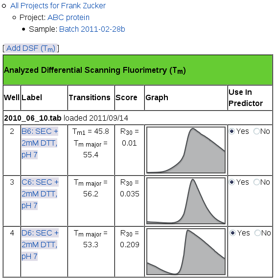
|
|---|
This page shows the name of the file you uploaded and the date you uploaded it in a row across the whole table. If you add more files, the most recent ones show up on the top of this table. For each well you selected from each file, you'll see:
- well number (position in the file, not in the plate),
- well label (which may include position in the plate),
- Tm for each transition, the midpoint of the transition from low to high intensity,
- R30 Score, the ratio of intensity at 30° C to the intensity at Tm for the major transition, and
- a small version of the Fluorescence vs Temperature graph,
- a switch for selecting which runs should be used in prediction.
From this page, in addition to using the navigation outline you can:
- Add another file of DSF results with the Add button above the table.
- Click No in the right column to drop the well from the set used in prediction (this hides the graph; you can bring it back by clicking Yes).
- View the details of the curve fitting results for one well: click on the well name or on the small graph.
NOTE: If you use the Back button on your browser after changing which runs are used, RELOAD THE PAGE. Otherwise you would see the old value of average R30.
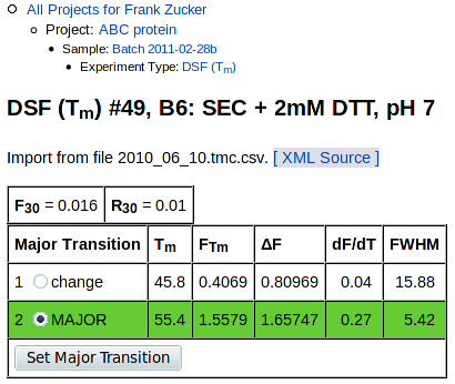
View model details and select major transition
In addition to showing you the fitting results, if there are multiple transitions the detail page allows you to alter the choice of major transition. The program chooses the model curve with the steepest slope as the major transition, which is usually the same as the curve with the largest overall intensity change. But there may be cases where you want to choose a different transition as the major one, e.g. if a more gradual transition has a greater intensity change, or if the model does not match the observed data well.
The top of the curve fitting detail page has overall summary values, values for each transition, and graphs of Fluorescence vs Temperature and the derivative, dF/dT, vs T:


|
|---|
In theory a single transition is steepest at its midpoint, at the temperature where there are equal concentrations of folded and unfolded protein. Well-separated multiple transitions should also have roughly equal concentrations of proteins in the "before" and "after" state at the midpoint of each transition. For nearby transitions, e.g. those with Tms closer than the sum of their FWHM, midpoints become more difficult to determine and to interpret.
The tables at the top are summary values and values for each transition:
|
|
|---|
Summary values are:
- F30, fluorescence at 30° C and
- R30 =(F30 / FTm for the major transition).
Below these are values derived from fitting one or more Boltzmann transitions to the observed data, if any could be fit (see tm_calc documentation for details). Derived values are:
- Tm, midpoint of the transition ("melting temperature")
- FTm, fluorescence intensity at Tm
- ΔF, change in fluorescence for this transition
- dF/dT, slope at Tm for this transition
- FWHM, transition width at half the maximum slope in °C
The table also includes buttons for selecting the major transition, if there are multiple transitions and if you are the owner of this sample. To start with, the transition with the steepest slope is selected as the major transition, highlighted with a green background in this table. In some cases there may be another transition with a lower slope but more overall intensity change, or the curve fitter may have fit multiple transitions improperly; in these cases you can use this button to select a different transition as the major one. This will move the green bar, and recalculate the value of R30 in the summary at the top of this page and on all other pages.
NOTE: After changing the major transition,
DO NOT use the Back button on your browser.
Use the navigation outline instead.
Otherwise you would see the wrong value of
R30 unless you reload the page.
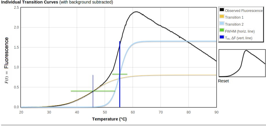
In each of the graphs,
- Observed fluorescence data is in black.
- Fitted fluorescence values are in color.
Transitions are marked with horizontal and vertical lines:
- Horizontal green bars span FWHM, the temperature range for the transition.
- Vertical blue bars mark Tm, with a thicker bar for the major transition.
| ... |
|---|
|
|
| ... |
In the first plot, above, the total fitted curve is in red and a small orange circle shows the intensity at 30° C. Horizontal bars are at height FTm. Each vertical bar spans the range of fluorescence covered by that transition, starting from the top of the previous transition (if any) and going up by ΔF.
| ... |
|---|
|
|
| ... |
The middle graph, "Individual Transition Curves," will look like the first one unless you have multiple transitions or a non-zero background (especially if you have uploaded an xml file with an exponential background). This graph shows the observed data with the background subtracted, along with each of the transitions that make up the total fitted curve shown in the first plot. As in the first plot, vertical bars are ΔF high. But in the second plot these bars all start from 0 fluorescence so you can directly compare the intensity changes of the transitions. The bars cross at the midpoint of the fitted transition, i.e. at ΔF/2.
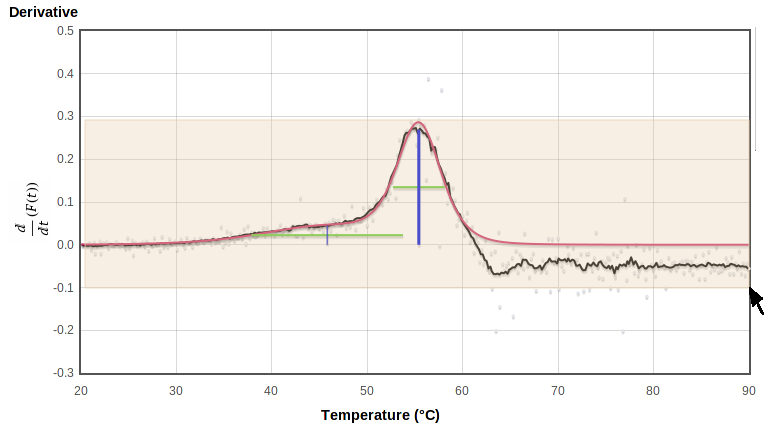
| ... |
|---|
|
|
The bottom curve shows the raw observed derivative dF/dT in gray, smoothed observed derivative in black, total fitted derivative in red. The height of the vertical bars here show the maximum slope of the fitted curve. Horizontal bars span the model derivative peak at half that maximum slope.
In such a plot, an ideal transition has its midpoint at the center of a symmetric peak, rising from and falling to zero. The ends of the green lines should touch the black observed curve on both sides. In reality, for many proteins the peak tends to fall off faster above the highest Tm than it rose below that point, and the derivative curve falls below zero at higher temperatures. The decay of the fluorescence signal may be due to protein aggregation followed by either precipitation or exclusion of dye. The curve fitter attempts to avoid modelling these high temperatures where the signal decays.
In addition to high-temperature fluorescence decay, the smoothing required to give a reasonable signal on subtracting two noisy signals may distort dF/dT peaks. As a result, the curve fitter may not put Tm exactly at the center or at the highest point of the peak, and the horizontal bar may not line up exactly with the half-maximum of the observed derivative peak on this plot. However, the fitter generally produces good fits to the observed data (rather than to the derivative) resulting in reasonable estimates for Tm and thus R30.
Zoom in on plot
To zoom in on a region of any graph, select the region of interest on the plot or on the thumbnail to the right by holding the left mouse button down while dragging it from one corner to the opposite corner of the rectangle you want to view. This will highlight the selected region with a pale pink background as you drag:
|
|---|
When you release the button it replots using the selected rectangle (the upper and lower limits of the smoothed derivative, in this case) as the plot limits:

|
|---|
You can zoom in further by selecting again on this zoomed plot. The thumbnail on the right shows which part of the original range is being displayed:
|
|---|
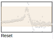
You can zoom to a different region by selecting on the thumbnail. To zoom back out to the full plot, click Reset under the thumbmail.
Once you have selected the major transitions and the runs to use in the predictor, return to the Sample page e.g. by clicking the "Sample: ..." line in the navigation outline. The iaverage R30 value will be displayed next to the TM (aka DFS) box in the list of experiments you have already loaded (last row of this table):
|
|---|
| . . . |

|
| . . . |
Dynamic Light Scattering (DLS)
Dynamic light scattering indicates the abundance of particles within each range of hydrodynamic radii, from small molecules to large aggregates. Monodisperse samples, having all particles of similar size, tend to crystallize and diffract more readily. In our initial predictor, polydispersity (broad or multiple peaks) was not as predictive as oligomerization state, quantified as the molecular weight estimated from the radius of the major peak divided by the weight of a monomer calculated from the sequence.
To enter or upload dynamic light scattering results, click DLS in the "Add ..." row at the top of the "Experiments" table on the Sample page, or click Add DLS within the table. You get a form where you can either load a file or enter values by hand:
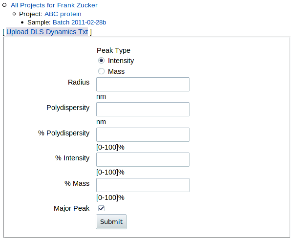
|
|---|
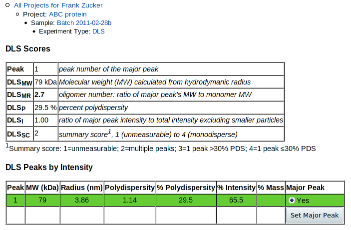
If you have a DynaPro DLS machine with Dymanics software, and you have a DLS experiment (".exp") file, you should be able to export a text (".txt") file which you can upload to get the best analysis. (If not, see below). It is simplest to export everything from the ".exp" file; you should at a minimum export "Results Summary" and "Regularization Results." You can then click Upload DLS Dynamics Txt to upload that .txt file. This gives you a page with summary scores, peak analysis and a histogram of intensities, and allows you to alter the selection of the main peak:
| . . . |
|---|

|
The table at the top summarizes the results. The key value used in predictions in HyGX1 is DLSMR, the ratio of the major peak's molecular weight to the MW calculated for the monomer from the sequence.
Next is a table of values for each peak showing calculated MW and values as in the Dynamics table: radius, absolute and percent polydispersity, percent intensity and percent mass. The last column allows you to change the selection of the major peak. The currently selected major peak is highlighted with a green background, and is plotted in green in the histogram below. To change the major peak, click the Change radio button for the new major peak row, then push Set Major Peak. This recalculates the values in the summary table and changes which peak is colored in the histogram below.
At the bottom of the page is the histogram of percent intensity versus radius. This gives you a graphic view of the data to allow better evaluation of the results, and to help in selection of the major peak.
PROSPERO stores peaks by both intensity and mass, but currently uses only the intensity peaks. A choice to use mass peaks instead may be implemented later.
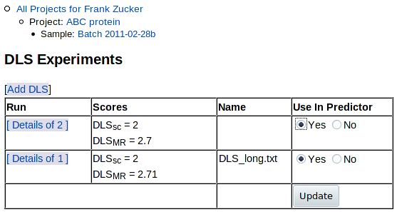
You can now click on Experiment: DLS in the navigation outline to see the list of DLS results (just this one, so far), from which you can add more DLS runs for this sample:

|
|---|
If you have a DLS machine with different software you should still be
able to find and enter at least the radius for the major peak.
Even if you at one point had the right software and .exp file, you may now
only have summary data: radius and possibly polydispersity,
percent intensity and percent mass. This may be in the form of a screen
image from Dynamics, e.g.:

Given such data, you can enter the values for the major peak by hand.
The major peak's radius is the only value used in the original predictor,
and the only one currently required on the form. But if you have the other
values available, you should enter them for the major peak so that you can
store and share the data with other group members.
The major peak is the second row in this case: the peak with most of the intensity, and the only one with a radius in the ~2 to 10 nm range. Leave the peak type as "Intensity", unless you're really sure you want to use mass peaks. (In this case, peak 1 has most of the mass but little intensity, and is much lower MW than a protein, so it's not a suitable major peak). In this case, you'd enter:
- Radius (nm): 3.86 - this is the only one required
- Polydispersity (nm): 1.14
- % Polydispersity: 29.6 (or leave it blank and it will be calculated from absolute polydispersity / radius)
- % Intensity: 65.5
- % Mass: 0.03
When you hit Submit, the molecular weight of the peak will be calculated from the radius. You get a DLS detail page with only the details you entered showing:
|
|---|
Only one peak and no histogram is shown, since that's all the data you've entered.
NOTE: If you want to be able to upload data extracted from other machines, it may be possible to write a converter to transform your data into a form PROSPERO can read. But this would only be worth while if your DLS software does not provide similar analysis, e.g. peak tables and a histogram.
Click on Experiment: DLS in the navigation outline to return to the list of DLS results:
|
|---|
As for the list of DFS results, you can choose which results to use in the predictor: click "Yes" or "No" under "Use in Predictor" - then hit Update. You can now click on Sample: ... in navigation outline to return to the sample summary page. The Experiments summary section shows the average DLSMR and DLSSC of the DLS runs you have selected for use in prediction:
|
|---|
| . . . |
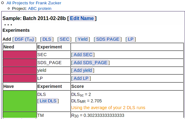
This table also shows the types of experimental results not yet loaded: SEC, SDS PAGE, yield, and limited proteolysis.
Size Exclusion Chromatography (SEC, aka Gel Chromatograph)
In addition to its use in protein purification, size exclusion chromatography provides information on the composition and oligimerization or aggregation state of the sample. As expected, among our samples those absorbance curves showing single Gaussian peaks and little else tended to have better outcomes (though this only applied in our predictor for high-molecular weight proteins with less than "extremely strong" yields.)
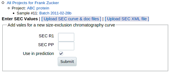
To add data from an analytical or preparative SEC run, go to the Sample page (shown above) and click on SEC in the "Add" row above the table, or on Add SEC within the "Need" section of the table. You get this form:
|
|---|
You have 3 options for adding SEC data:
- Enter SEC values SECR1 and SECPP on this form. Only do this if you can't do either of the others.
- Upload SEC curve & doc files exported from AKTA software. If you have the .res file and the software, this is the best option.
- Upload the SEC XML file created by an input module modified to handle data from other chromatography software (see downloads for sec_calc.pl documentation and source).
Enter SEC values
The values PROSPERO wants are:
- SECR1:
- The residual after fitting one
Gaussian peak to the absorbance curve over the whole range of fractions
collected:
| Observed A280 - 1 Gaussian peak | / (Observed A280 - background)
integrated over all fractions.
- SECPP
- The purity of the fractions pooled to make this
sample:
(A280 of main Gaussian - background) / (Observed A280 - background)
integrated over the fractions pooled for this sample, where "main Gaussian" means the Gaussian peak with the largest area within the pooled fractions, not necessarily the main peak in the whole curve.
If you have the curve data in numerical form but you cannot convert it into a form PROSPERO can use, you may be able to use other software to fit Gaussian peaks to the SEC curve and calculate the values yourself. Otherwise, if you have an image of the SEC curve you can make a rough estimate of the values by comparing the image to the examples below. To fit Gaussians to SEC data, you can follow the procedure used in sec_calc.pl:
- Use gnuplot or other curve fitting software to fit a single Gaussian peak and a linear (or more complicated if you want) background to the data, using the largest peak in the curve to get initial values for the center and height of the peak.
- Use gnuplot or other software to subtract the model with 1 Gaussian peak and background peak from the observed to get the residual curve.
- Use Perl or Excel to sum the absolute values of that residual; divide that by the total difference between observed and background to get SECR1
- If there are more peaks in the residual curve near the pooled fractions, especially if SECR1 is greater than 0.2, use either those residual peaks or the original curve to get initial values for additional Gaussians.
- Repeat the fitting process until you have Gaussians accounting for all the major peaks and most of the absorbance near the pooled fractions.
- Sum the area under the largest Gaussian within the range of pooled fractions, and divide that sum by the total observed - background in the pooled range to get SECPP
Estimating SEC values by eye
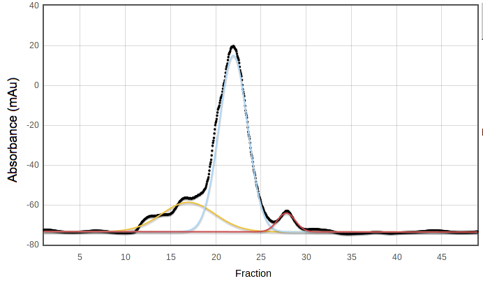
For PROSPERO's prediction, the key cutoff is SECR1 < 0.2 -
this is a nearly symmetric peak with possibly a few small additional bumps.
For example, this curve has SECR1 = 0.18, just under the cutoff:

Curves with less symmetrical main peaks or with a higher fraction of
absorbance in other peaks will have SECR1 > 0.2 . Curves with
many large peaks or with irregular backgrounds may have values above 1,
since a single Gaussian is a poor model of such curves.
SECPP is the fraction of the pooled peak which is not under
any other peak in a suitable multiple-Gaussian model. For example, in the
following curve the blue peak has most but not all of the area under the
pooled fractions, 19 to 25; SECPP = 0.92:
SECPP is not used in the original version of PROSPERO's
predictor, but may be a valuable number for comparison of different
samples of the same target protein.
Upload SEC curve & doc files from AKTA software
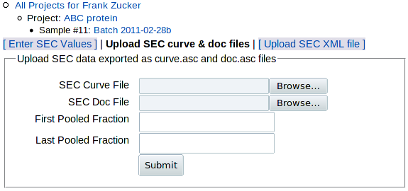
Click on Upload SEC curve & doc files to get the upload form:
|
|---|
The main data from SEC is the absorbance curve, usually A280 vs time or volume. But such data need additional documentation, or metadata, for proper interpretation: start and end times (or volumes) of fraction collection, flow rater, fraction size and the range of fractions pooled to make the sample. The software that comes with AKTA columns, PrimeView Evaluation or Unicorn, allows you to export two files: one with the absorbance curve (curve.asc) and one with all but the last piece of metadata (doc.asc) - see export instructions below. (If you have other column software and you want to put it into a form that you can load here, see the sample SEC curve and doc files to see what data is expected.) You can then use the above form to:
- Browse to select the SEC curve file (absorbance data)
- Browse to select the SEC doc file (metadata)
- Enter the range of fractions pooled in this sample, which is not included in the doc file.
You'll have another chance to enter or select the pooled range based on the curve, in case you can't get the range from your notebook or LIMS.
Export curve and doc files from AKTA software
To name your files, you will need a unique identifier (SEC ID) that you can remember or easily retrieve. This ID must containing only letters and numbers, e.g. "12345", because PrimeView will read, but won't let you write, file names with special characters such as space, dash or underscore. If you have only one SEC per sample, you can use the sample number from your LIMS if you have one, or the sample # from PROSPERO shown to the right of the sample name in the top navigation outline. If you have more than one SEC curve, e.g. from analytical SEC, you may need to add distinguishing letters to the sample ID to make your SEC ID unique, e.g. 12345a, 12345b, etc.
Once you have a SEC ID:
- Find and open your .res file in PrimeView Evaluation
NOTE: The .res files are initially named by date and number within date e.g. 2011Mar01no001.res, which may make it difficult to identify the correct file for a given sample. Once you have found the file, it may be useful for your own purposes to add identifying information to the name such as the SEC ID. To do this:- Choose File, Save as ...
- Enter the SEC ID before the date, followed by a standard letter
01: [file name]_UV
Now export the documentation (metadata) file:
- Choose File, Export, then Documentation ...
- In the Export Documentation dialog box, uncheck the first 4 items but make sure the last item, Logbook, is checked
- Click Export ... on the bottom row to bring up a file browser
- Use the same folder and SEC ID as the curve file, but append "doc" to the identifier, not "curve" - e.g. 12345doc
- Click OK to save the doc file.
You now have absorbance vs time (or volume) in e.g.12345curve.asc, and a log by time (or volume) in 12345doc.asc . PROSPERO should be able to handle any combination of time or volue in either file, but you might be the one to discover an odd case where it has problems. In that case, you may need to export both the curve and doc files in units of time and upload again:
- Under Edit on the menu bar, select Chromatogram Layout
- On the X-Axis tab (3rd from left) select Time as the base
- Click OK and re-export the curve (File, Export, Curve ...)
- Re-export the documentation (File, Export, Documentation ...) except this time make sure Time is selected as the base on the right side of the Export Documentation dialog.
- Older versions of the software, at least version PrimeView 5.0 (based on UNICORN 5.0.1) run on older operating systems e.g. Windows XP but not on Vista or Windows 7.
- By default, the program folder is Unicorn, so:
Application are in C:\UNICORN\Bin.
Results files are under C:\UNICORN\Local\Fil\prime\Results. - If you're on a computer not connected to chromatography equipment,
you may get a blank "Open file" dialog box when you start. To fix:
- Open PrimeView (C:\UNICORN\Bin\cyscon.exe)
- Click Clear All in the error dialog that comes up.
- Re-open PrimeView Evaluation (C:\UNICORN\Bin\emain.exe).
Once you submit the curve and doc files, you get a preliminary image of the curve which allows you to numerically or graphically select the range of pooled fractions:
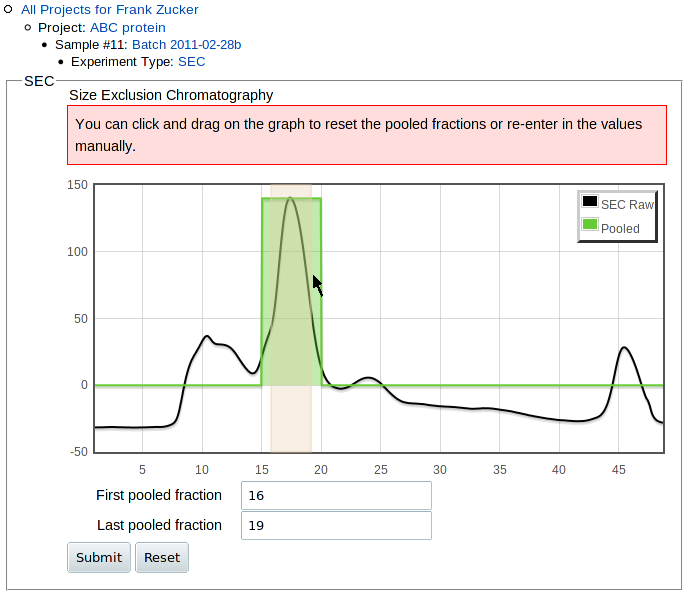
|
|---|
SEC Curve Fitting Results
Once the curve-fitting is done, you get a page with a a table summarizing the results at the top:

|
|---|
Values of Residual for 1 Gaussian (SECR1 below 0.2 are good, at least in our initial predictor. Higher residuals may indicate a higher fraction of proteins other than the target in the original purification, possibly due to low yield for the target protein. or a range of oligomerization states,
Sample purity (SECPP) is based on the model the program sec_calc.pl determined was best, but this choice may be wrong. If you get a purity value closer to 0.5 than 1.0, look at the plot of individual fitted peaks at the bottom of the page to see if the model is reasonable. You may find that the program has picked a model with too many peaks, e.g. 2 similar Gaussians under what appears to be a single peak. Users who want more accurate purity estimates can download the SEC input module and run it locally using the "-n" option to specify the maximum number of peaks to find, then upload the resulting XML file.
Other values in the table come from the metadata: flow rate, pooled fraction range, fraction volume, and column date.
Below the table are plots of the observed absorbance curve (black) and the overall model of fitted absorbance (red):
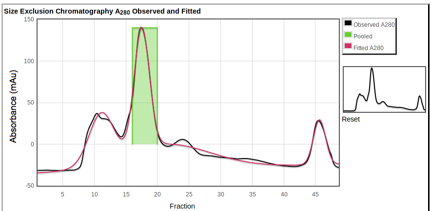
|
|---|
Also shown are the pooled fractions (green). You can zoom in by selecting a region on the main plot or on the overview to the right.
At the bottom is a plot showing the individual peaks fitted to the data,

|
|---|
If you have chromatography data from non-AKTA software, or if you have AKTA software but you want to adjust the parameters used in curve fitting (e.g. change peakmin or npeaks to avoid excess peak fitting), you can download the SEC input module sec_calc.pl and run it on your own computer with modified parameters or modified code to create SEC XML files (.sec.csv files). You can then upload those files PROSPERO by clicking Upload SEC XML file in either of the other two "add SEC" pages. You get this form:
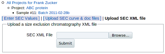
|
|---|
which allows you to select and upload the XML file. You then get the SEC details page as for uploaded curve and doc files.
Modifying the SEC input module for other chromatography software
SEC XML files contain both absorbance curves and metadata, including pooled fraction range if it's available. If you have non-AKTA chromatography software, you will probably find it easiest to generate the proper XML files by modifying or using parts of the existing input module sec_calc.pl , rather than starting from scratch. This program carries out several functions sequentially in separate subroutines, which you can modify or use independently:
- Parse the input absorbance curve: handles files with "min" or "ml" and "mAu" data in delimited columns; would need modification for files with data in rows, or with different column headers.
- Parse the input documentation (log file): needs careful tailoring to each version of the log file format, or replacement with manual input or fixed values of metadata, so that the program can convert the X axis units of the curve file (time or volume) into fractions, determine the range to fit, and calculate pooled purity.
- Fit the curve: make initial estimates, pass estimates and data to gnuplot, retrieve the results, calculate residual, and repeat.
The key XML tags used by PROSPERO are <DERIVED_VALUES><R1> and <DERIVED_VALUES><BEST_MODEL><PP> for SECR1 and SECPP values, respectively. The <MODEL> values for background and peaks and the fraction, absorbance and pool columns from the <MODEL_VALUES> table are used in displaying the observed data and fitted model on the SEC details page.
If you enter or upload more than one SEC result, e.g. from sequential preparative runs or an analytical run after a preparative column, you can see the list of SEC results by clicking on SEC in the navigation outline, or on List SEC in the Sample page experiment table. You can then select which run(s) to use in outcome predition, similar to the selection of DLS or TM runs.
Once you have entered or uploaded all your SEC results, when you go to the sample view page using the navigation outline you'll see the SEC scores (averaged for all the SEC runs you've selected to use in the predictor) summarized in the Experiments table:

|
|---|
| . . . |
Expression Yield
Proteins with high yields in heterologous expression systems (or in high abundance in natural sources) provide sufficient material for purification away from other proteins; high yield may also indicate stability of the properly folded protein in the expression system. In our initial samples, for large proteins (>36kDa) those with extremely high yields in high-throughput screening (equivalent to ~100 mg or more per liter of culture) were much more likely to produce well-diffracting crystals than those with lower yields.
To add screening or large-scale expression yield results, click Yield in the "Add" line above the sample Experiments table, or Add Yield within the table. You get a form:

|
|---|
| . . . |
where you can enter yield from large scale expression, gel score or both.
For large scale expression, enter the total mass of purified protein in milligrams for Yield (mg). To be consistent with the screening gel yield, this should ideally be the mass after the first affinity column (e.g. immobilized metal), but protein concentration and volume are more commonly measured and recorded after the final step. Then enter the volume in liters of cell culture used. For cell-free expression systems, use the reaction volume for documentation purposes. (Cell-free systems were not used in training the predictor, but this will not be an issue in most cases since such systems are most commonly used for small proteins, and the predictor does not use yield for proteins under 36 kDa).
For gel scoring, e.g. of samples from high-throughput screening or from large scale expression, compare your gel band to the soluble protein lanes, the right lane of each pair in examples shown to the right of the form. These lanes have protein from about 8% of a 600 μL culture = 48 μL. Each score unit is roughly a factor of 3 difference in yield, so the mass of protein band on the gel and the corresponding large scale expression yield are approximately:
| Visual Yield Score | Band Appearance | Mass in band (μg) | Yield from Large Scale (mg/L Culture) |
|---|---|---|---|
| 5: Extremely high | heavily overloaded | ≥ 5 | ≥ 100 |
| 4: High yield | strong but not smeared out | 1.5 to < 5 | 30 to < 100 |
| 3: Medium | easily detectable but not strong | 0.5 to < 1.5 | 10 to < 30 |
| 2: Weak | barely detectable | 0.15 to < 0.5 | 3 to < 10 |
| 1: Not detectable | no visible band | < 0.15 | < 3 |
If your gels have the protein from a similar volume of culture, choose the score for the soluble band that is most similar in intensity to your band.
For gels using protein from very different volumes of culture, adjust the score by about 1 for each factor of 3. For example:
- If your gel has protein from ~15 μL culture volume, then bands that look like example lane 4 (strong) should be scored as 5.
- If you use protein from 150 μL, then bands that look like example lane 5 (extremely strong) should be scored 4, though you may find it hard to distiguish these from lanes with even broader smears of stain that should be scored as 5.
The cutoff level for the initial PROSPERO predictor is 5, so if you use large volumes for your screening gels you should use the large scale expression mass and culture volume instead if possible.
In addition to the gel score, you can select and upload a gel image file. You should either crop the image to include only the lanes of interest, or mark the relevant lanes on the copy of the image file you upload - preferably with a mark above or below the body of the gel or at least far from the band of interest. Later versions of PROSPERO may include automated analysis of such gel images for automatic scoring; this would require lanes without extraneous marks to avoid complications in the estimation of background - usually a trivial task for humans but not for software.
Once you click Submit, you get a Yield details screen:
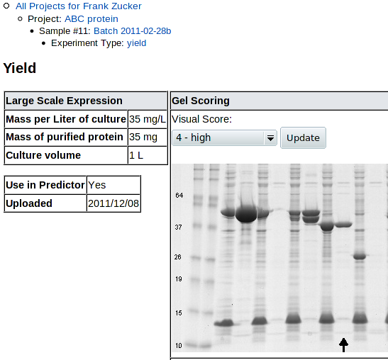
|
|---|
| (followed by another copy of the scoring example gel) |
You can review and revise the visual score here. Note that uncropped high-resolution gel images may have the lane of interest off the side of the screen, so you need to scroll right to see the lane, then back left to change the score.
If you have added more than one yield result (more than one pair of visual score and large scale yield), you can see the list and select which one(s) to use in the predictor by clicking on Yield in the navigation outline, as for other experimental results. Click on Sample in that navigator to go back to the Sample page and add other types of experiments, or make a prediction.
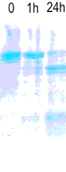
Limited Proteolysis (LP)
Super-stable proteins, those that show little change in intensity or molecular weight after 24 hours of treatment by a variety of proteases, tend to crystallize and diffract well in our experience. Unfortunately, few proteins fall into this category. We have developed a scoring system to rate proteins based on the intensity and position of the bands seen after 1 or 24 hours of proteolysis. can store the image of the resulting gel and the average score for a battery of proteases, though it cannot yet use this score in predicting outcome.
Click on LP in the Add row above the sample Experiment table, or on Add LP within the table, to add limited proteolysis results. You get a form for entering the LP score,

|
|---|
followed by a table of rules for scoring limited proteolysis:
Below that are example gel lanes applying the scoring method:
| Score: | 1 | 2 | 3(a) | 3(b) | 4 | 5 |
|---|---|---|---|---|---|---|
 |
 |
 |
 |
 |
 |
 |
| No visible bands ≥85% of original MW | Half lost in 1h at ≥85% MW | Little change in 1h but half lost by 24h at ≥85% MW | 50% to 90% remains at 1h ≥85% MW | Little change at 1h, half remains at 24h ≥85% MW | Little change in intensity or MW in 24h |
For these Coomassie Blue-stained gels, purified protein at 1 mg/ml in HEPES pH 7.5 buffer with 500mM NaCl, 5mM CaCl2 and 10% glycerol was exposed to 20 μg/mL trypsin, chymotrypsin, subtilisin A or endoproteinase Glu C for 0, 1 and 24 hours; reactions were then stopped with 0.17M acetic acid. |
Score the group of lanes for each protease (e.g. 0, 1h, 24h) separately, then take the average score and enter it here.
Once you hit Submit, you get a page showing the score and gel:

|
|---|
You can now Use the navigation outline to see and select from the list of LP results (if you have more than one) with the LP link, or go back to the Sample page with Sample to add other experiments, or predict.
SDS PAGE
Electrophoresis is a standard method for assaying protein purity. But since SDS PAGE is often used to determine if proteins are pure enough to attempt crystallization, we have little data on proteins which show major impurities on gels. Therefore we did not find the quality of SDS gels for purified proteins to be predictive of outcome (if they're called "purified", they mostly have good gels). PROSPERO allows storage and sharing of images and scores of these gels for confirmation of purity.
To detect both minor impurities and impurities near the same molecular weight as the target, gels can be run with two or more lanes for each sample containing total protein mass differing by a factor of 2 or more, e.g. 1.5 and 3.0 μg for Coomassie Blue staining.
To upload a gel image, click SDS_PAGE in the Add line above the Experiment table on the Sample page, or click Add SDS_PAGE within that table. You get this form:
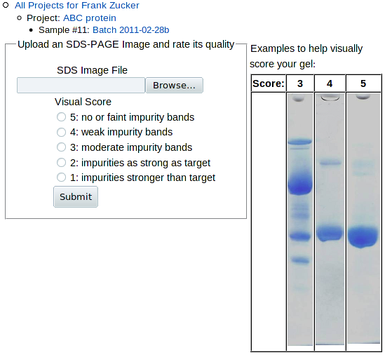
|
|---|
Browse to and select the image file for the gel. If you have gels with more than one sample, you may want to use a graphics program to label the lanes with sample identifiers or crop a copy of the image to include only the sample you're interested in. Use the examples on the right to determine which most closely resembles your gel, and check the appropriate score button. Note that all of the examples are for scores of 3 or above. If your sample has a lower score, further purification is probably in order.
Once you hit Submit, you get a page showing the image and score:
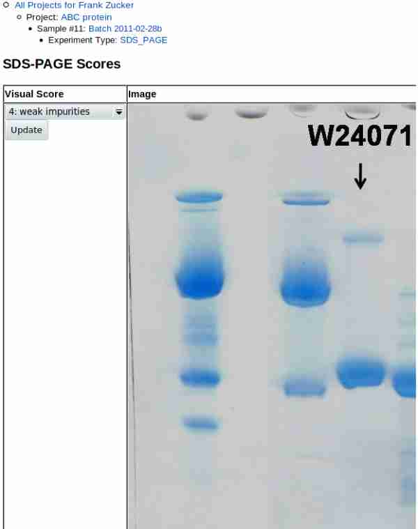
|
|---|
Note that gel images may be very high resolution, so if you did not crop the image you may need to scroll to the right to see the lane(s) of interest. Scroll back to the left to update the score after review.
Later versions of PROSPERO may feature numerically analysis of such gel images to estimate the puritiy of the major band, assuming that staining and scanning are linear with mass.You can now Use the navigation outline to see and select from the list of SDS gels (if you have more than one) with the SDS_PAGE link, or go back to the Sample page with Sample.
Summary of Sample Results
Once you have added all available results, go back to the Sample page using the navigation outline and you'll see the Experiments table with green bars for each experimental type:
| . . . |
|---|

|
Predict Crystallization Outcome
You can now click the Predict button and PROSPERO will use your data to estimate the likelihood of crystallization and diffraction for your sample. If you have some data missing, you can still submit your sample for prediction - but the prediction may not be as accurate as it would be with more results (see HyGX-1 to see which results are most valuable for your sample).
NOTE: for proteins of prokaryotic origin, the Pxs server predicts crystallographic success of purified protein from sequence alone at least as accurately as PROSPERO, when it is available.
The prediction page has 5 parts:
- The input experimental and sequence values used to make the prediction
- The predicted Diffraction Score (DS) for your sample, the mean DS for proteins with similar input values
- Suggestions for further work if initial screens fail
- The decision tree by which this prediction was made.
Diffraction Score
The Diffraction Score (DS) is a value from 0 to 6 meaning:
- 6: 2.0 Å or better diffraction
- 5: 2.8 Å to 2.01 Å diffraction
- 4: 4.0 Å to 2.81 Å diffraction
- 3: 10 Å to 4.01 Å diffraction
- 2: Diffraction worse than 10 Å
- 1: No diffraction
- 0: No mountable crystals
Input Values and Predicted Outcome
The input experimental and sequence results are presented on top,
with a pale blue (or red) background for criteria with values favoring
(or disfavoring) crystallization, followed by the prediction:
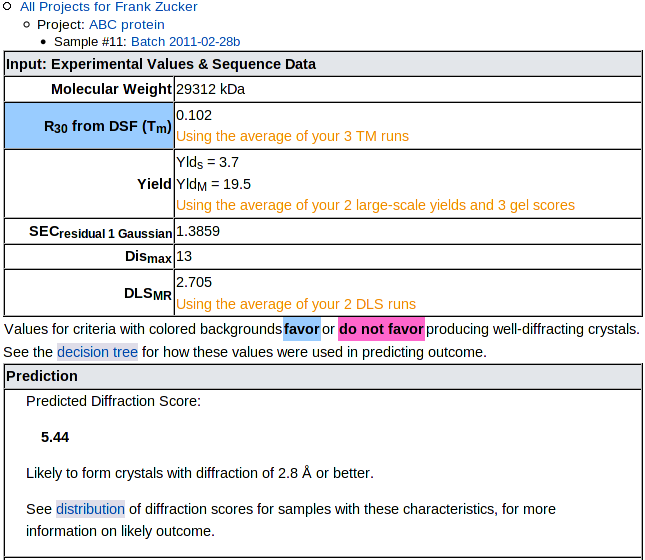
|
|---|
The prediction is the mean Diffraction Score of samples in our training set which had input values similar to your sample. See the decision tree for details on how the input values are used to categorize samples. Below the numerical prediction is a brief text description of the likely outcome, then a link to the distribution of outcomes for similar samples. NOTE: Some categories with with low mean DS include a few successful targets, so check the distribution, not just the mean.
Recommendations for Difficult Targets
Next comes suggestions for further steps you might take if your initial crystal trials produce no hits:

|
|---|
These suggestions are based on the assumption that you have already set up initial trials, and you are looking at this prediction because those trials failed. For samples with poor predicted outcomes, the suggested changes in sequence, vector or protocol are intended to move your sample to a category with a better predicted outcome. We do not have extensive data on the effects of such changes on of individual targets, but we do have several cases where a small change (e.g. deletion of a few amino acids) greatly improved both the predicted diffraction score and the actual outcome.
Below the suggestions is a plot of the distribution of outcomes:
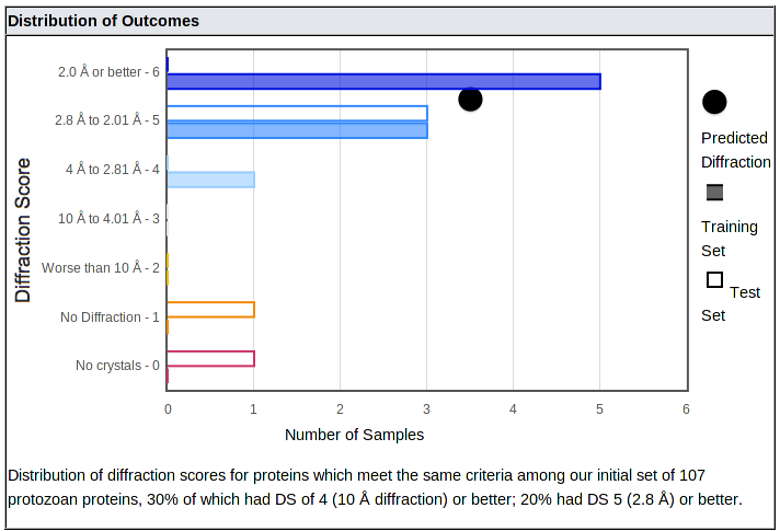
|
|---|
The distribution shows how often samples with properties similar to yours produced crystals with each range of diffraction, from better than 2 Å (top bar) down to no diffraction or no crystals. (In all cases, salt crystals were excluded.) It is important to consider both the mean and the distribution, since some categories of proteins with moderate or low means produced a number of well-diffracting crystals - they just aren't as likely to do so as categories with higher means.
The number of samples in our training and test sets are shown with closed and open bars, respectively; these bars are color coded from blue (best diffraction) to red (no crystals). The mean of the category is shown as a black dot.
Decision Tree
Currently, the predition is made using the HyGX-1 predictor. The tree used for your sample is shown at the bottom of the prediction page:
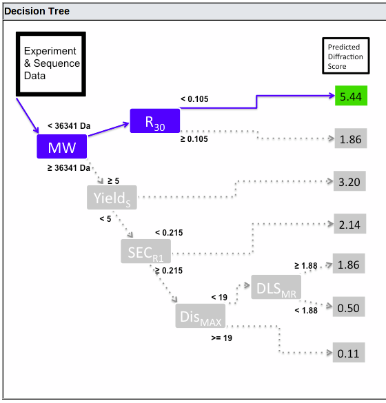
|
|---|
This shows the decision path, from left to right. At each branch point, the path taken is controlled by the value for the criterion shown in the blue box (or if the value is missing, the box is shown in red and no further path is taken). The predicted Diffraction Score is shown on the right, colored green, yellow or red for good, intermediate or bad predicted outcome.
The HyGX-1 Predictor
The initial PROSPERO predictor uses a simple binary tree to categorize samples, with one value used as a criterion at each branch point as shown above. The criteria, mean diffraction scores (and probability of getting crystals with 2.8 Å diffraction or better, based on 107 eukaryotic samples) are:
-
Molecular weight of monomer calculated from sequence
< 36.3 kDa:
- R30 from DSF (Tm) < .105: 5.4 (79%)
- R30 ≥ .105: 1.9 (21%)
-
Molecular weight ≥ 36.3 kDa:
- Yield score = 5 (≥ 100 mg/L culture): 3.2 (33%)
- Yield score < 5 (< 100 mg/L culture):
- SECR1 < 0.215: 2.1 (16%)
- SECR1 ≥ 0.215:
- Dismax ≥ 19: 0.1 (0%)
- Dismax (longest stretch of
predicted disorder) < 19:
- DLSMR (ratio of MW from Hr to MW of monomer) ≥ 1.88: 1.9 (0%)
- DLSMR < 1.88: 0.5 (0%)
This means that DSF (Tm) is used in the predictor only for proteins under 36 kDa, yield is only used for larger proteins, and SEC is used only for larger proteins which do not have extremely high yields.
Disorder is only used for large proteins with less than extreme yields and SEC curves with more than 21.5% residual from one Gaussian. DLS is only used for large proteins with less than extreme yield, bad SEC and no stretches of predicted disorder longer than 18 residues. But even when they are used, disorder and DLS were not very useful in predicting outcome amoung the proteins we tested: none of those with high MW, low yield and bad SEC gave crystals with 2.8 Å diffraction or better, regardless of disorder or DLS.
Expanding the Predictor
The original HyGX1 predictor was based on 6 types of experiments run on 107 samples of protozoan protein. These proteins may be more representative of eukaryotic proteins in general than the mostly prokaryotic proteins usually used to train sequence-based predictors, but the predictor, the data storage and sharing system, could still be improved in several ways:
- Expand the formats acceptable for experimental results
- Expand the types of experimental results you can store
- Expand the types of results used to train the predictor
- Expand the number of samples used to train the predictor, to make the general predictor more accurate
- Use a different class of samples e.g. prokaryotes, different eukaryotes, protein complexes, protein/nucleic acid complexes, or membrane proteins, to make a predictor that is more accurate for that specific type of sample
If you have experimental results for DSF (Tm) or SEC in a format PROSPERO currently does not handle, you may be able to download and modify the existing input module to read your data. If you need help in making such modifications, or if you are successful and are willing to share your code with other users, please contact Dr. Ethan Merritt.
Also, please contact us if you have results from other types of experiments you would like to store, e.g. mass spectroscopy, NMR data or static light scattering. Given samples of the experimental results, we can determine the level of effort required to add a new experimental type to those stored in PROSPERO.
If you have samples of proteins similar to our original set (eukaryotes, especially protozoa) with consistently collected experimental results also similar to our original set (especially DSF (Tm), SEC, yield and DLS), and with final crystallization and diffraction outcomes, we would be interested in collaborating on expanding the sample size for our current general predictor.
We would be particularly interested if you have a substantial number of samples (for any class of proteins) with consistently collected experimental results (not necessarily similar to our set) and outcomes, and you want to work with us on developing a new predictor specifically for your class of samples.
Appendix
The Navigation Outline
The overall organization of data in PROSPERO is:

-- At all levels below "All Projects", an outline near the top of the page shows where you are and lets you move to higher levels. The outline shows whether you're looking at your own projects or "Group Projects", the name of project, the sample, and the sequence or experimental type if you're down that far. Each line is a link so you can jump up one or more levels - e.g. from an experimental result page to the Project page. NOTE: if you use the navigation outline, rather than the back button, then you won't have to use your browser's "reload" button to update the page to include all current data.
-- At each level there is a page with a table that lists what's at and below that level. This table lets you navigate to or add items below the current level. E.g. from the Project page you can jump to any sample in the project, or any experimental type within the sample; you can also add samples to the project or experiments to an existing sample.
Handling Multiple Experimental Results
Researchers will often have multiple results for DSF (Tm, from multiple wells in a single run or from multiple runs. Repeated DLS runs are also common. If you prepare each sample from a single large scale expression and purification, then you will probably only have one preparative SEC curve and one yield; PROSPERO allows you to enter multiple values in case e.g you combine multiple batches into one sample, or use analytical SEC to produce more than one SEC result. For all experimental types, you can select which values to use in the prediction in the that type's list of results. The mean of all selected values is used.
Complexes
PROSPERO allows you to enter multiple sequences for samples with macromolecular complexes. The HyGX1 crystallization predictor was based on single proteins, and therefore it is not known how well it works on complexes. Currently, predictions for complexes are based on the maximum estimated molecular weight and stretch of disordered residues, under the assumption that the largest macromolecule and the largest stretch of disorder are most likely to interfere with formation of well-ordered crystals. More data is needed to assess the validity of this assumption and to make accurate predictions for complexes.